I’d also say 5, but the horizon has lost the round shape, and it is supposed to be a planet. Anyway, it won’t be visible in the badge.
The planet would be visible if it was not just a line, but a plain circle in the corner, with a different color.
I feel very strongly about that. The Ada community should not add to the misconception that the name of the Ada programming language is an acronym, hence should not use “ADA” anywhere.
Maybe I’m missing something, but the original post in this thread suggested to use the following
![]()
for “Ada crate of the year” awarded projects. That’s a badge in mixed case. Then why can’t we develop a mixed case badge for “Ada inside”?
3 Likes
I vote for the original logo. The badge use case is interesting but it’s not going to be the only one for the icon, and for the other use cases a full recognizable logo is better.
I’d rather have a tiny logo in badges, than yet another logo for Ada.
Maybe we should just get the Ada horizon logo in simple-icons and the readability problem disappears.
Look, this is the XML logo which is also an unreadable textual logo.
!(image)]

But as it is a simple-icon we can add the logoSize and set it to auto, and the result is much nicer and readable.

More on this:
3 Likes
I don’t see a satisfying alternative solution.
1 Like
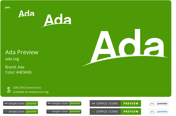
I opened a Pull Request with the standard Ada horizon logo, as initially prepared by @Heziode and further optimized with npx svgo --no-color icons/ada.svg (the commit is marked with the co-author key).
Preview from https://simpleicons.org/preview (there’s no way to make a preview with the logoSize attribute):
4 Likes
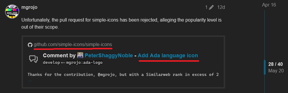
Unfortunately, the pull request for simple-icons has been rejected, alleging the popularity level is out of their scope.
I tried to add arguments in favor of measuring the popularity in fairer ways.
If you want to add more, take into account their contribution guidelines, and be respectful and rationale, since I guess they won’t listen to any offensive rant or whining.
If you don’t have anything to add, some thumbs might at least show some support for the cause.
if they don’t listen, no drama, we will find our alternative.
This link will take you there, but it’s closed.
GitHub doesn’t forbid reacting and commenting on closed pull requests, if that is what you mean. I think repo owner could choose to lock it, though, but it isn’t.
1 Like
Don’t forget ada-logo/ada logo (olive green).png at bbe4201d222c21b78bba8dc6560e7b952ba13902 · sowebio/ada-logo · GitHub ![]()
Square and suitable for iconing , Ada not ADA…
Back to the origins, to promote a revamped vintage logo, in reference to the Ada logo of the AJPO (Ada Joint Program Office).
Like NASA returned to its original logo from the 60s, or BMW which has always kept the propeller in Bavarian colors, too many logos kills the logo.
The substance of a good logo is immutable, even if the form can subtly evolve.
Ada is the green language, in reference to its identification color during the international competition, but also to express the energetic frugality of a compiled language vs. an interpreted language: the logo must be green.
The word Ada must appear in the logo.
The logo must be simple enough and offer enough contrast to be iconifiable.
The logo must express the essence of the language: the planet is the message of the universality of Ada.
1 Like
That isn’t what I meant, I meant you didn’t post a direct link.
That’s a good one.
The horizons logo is rather “soulless”, but this one is actually interesting and sufficiently retro.
Not sure about the licence.
Hi,
Thank you for the compliment, it means a lot to us.
The horizon logo has good qualities. It’s simple and allows for a subtitle. But it’s not very expressive nor distinctive. We use it, however, because it’s good that Ada has a main logo.
Getting back to our old-school logo, our intention was to recapture the spirit of the original AJPO Ada logo, by offering a revitalized and vectorized version.
To my taste (I’m the CTO and co-manager of Sowebio), think of it as a “do what you want with it” copyright.
It is copyright Sowebio SARL France and our intern Senzo Rouhaud, under the terms of CC-by-nc-sa: Attribution + Noncommercial + ShareAlike - Deed - Attribution-NonCommercial-ShareAlike 3.0 Unported - Creative Commons.
Feel free to use it, we’re honored. You can mention our github, so that people can access vectorized versions.
Stéphane
1 Like
Anyway, thanks Manuel for trying.
@mgrojo 's post did have a direct link. The forum software obfuscates it a bit though the way it default displays links.
1 Like
Good news. The argument about the performance of Ada in the TIOBE index has been convincing, and the same maintainer has reopened it again, asking for other maintainers’ opinion.
4 Likes
That’s a good news they re-open the PR. TIOBE is on our side ![]()
I posted a direct link which should’ve been used.
Yep, I was just saying so did mgrojo’s post. Both of you posted a direct link to the same page, just in different ways. At least for me it was a direct link that worked good. It could be a browser difference though in how it shows for you vs me.
See the screen capture below. The red underlined locations work as direct links for me on Firefox in Win11. Those two spots take me directly to the pertinent spot in the conversation on that page. If you click in other spots (like the person’s name), it can take you elsewhere, like the person’s profile.
.png)
For whatever reason, when you post a link, the forum software sometimes formats it to look more like the image above, even if the posted link is a direct link to where you want to go. The forum software tries to fluff it up by default. I’m not a huge fan of the fluff, so when I post I’ll use a method either similar to yours or I’ll move the text around so it doesn’t produce those.
1 Like