AdaCore is releasing the Ada Horizon logo in the public domain:

There’s also a small website to make your own version: ada-logo-editor | Static website that provides easy customization of the Ada horizon logo
AdaCore is releasing the Ada Horizon logo in the public domain:
There’s also a small website to make your own version: ada-logo-editor | Static website that provides easy customization of the Ada horizon logo
0 voters
Would it be possible to make a variant of the logo with just the A and horizon more like a slash/arch and make it possible to insert a pictogram with a 1:1 (triangular) aspect ratio…?
Like ‘A(hummingbird’ or ‘A(lady-Ada’
The whole logo with 1:1 ratio.
I see what you mean for the A with slash/arch, but I don’t understand the “pictogram with a 1:1 (triangular) aspect ratio” part.
The A (possibly even upside down) and the arch divides the canvas more or less diagonally leaving a triangular field for the insert picture with sides 1:1:sqrt(2).
keep them stunned<
The logo for the forum could be even slightly modified ![]() :
:
What’s the fate of the current nice forum logo? It would be a shame to “lose” it…
Nice to have ‘Forum’ in the logo,. IMHO brown/gold color isn’t very appealing …. Sorry
Personally I ´m disappointed by (in fact I hate) that saw-blade pseudo-Ada modern girl since the beginning.
Anonymous junkie Lady and a sawblade
Nothing related to any the Ada tech world….
2014 Humingbird mascot to me is also a big miss: artwork is way too agressive (wings, beak, tail) , and does not represent some Ada’s tech qualities .
Why a bird ???
![]() Happy to get back to the fundamentals: readability, identity ( states « Ada »); and a clever idea to have some (organised) place to put a sub-subject as Forum, Gitter, Forge, … whatever you like (Belgium ?)
Happy to get back to the fundamentals: readability, identity ( states « Ada »); and a clever idea to have some (organised) place to put a sub-subject as Forum, Gitter, Forge, … whatever you like (Belgium ?)
![]()
Happy to see there’s some consensus about Fabien’s proposal.
Anybody is free to chose his own logo on his own private web-site.
![]() Forum, Gitter, Wikipedia, Wikibooks, Wikiversity, Forge, Reddit are public to serve the Ada Community.
Forum, Gitter, Wikipedia, Wikibooks, Wikiversity, Forge, Reddit are public to serve the Ada Community.
![]() I fully appreciate Jeremy’s , Olivier’s (& al) initiatives to have brought us a décent forum and other social support.
I fully appreciate Jeremy’s , Olivier’s (& al) initiatives to have brought us a décent forum and other social support.
Once again, very happy that an unified Ada logo adoption will show a long awaited homogeneous representation of our community to the outside world ![]()
![]()
![]()
This was a huge part of why I picked it for this forum and ada-lang.io . What I was trying to do, was establish a visual break for a modernization of the language, moving past the tens of outdated and often abandoned sites I ran across while learning Ada.
Olivier designed it with the gold background as a callout to the Ada coin logo. To me this showed respect to the past, while the androgynous look and saw blade in how it represented a “tool for everyone.” The pattern also looks very good and distinct at all scales, especially in tabs. It’s an exceptionally clean and fun graphic.
My counterpoint to the Ada horizon is that the entire world doesn’t speak English or use Latin characters, and it doesn’t seem to scale as well or be as distinct in tabs.
Personally, I don’t care what gets used, I just wish the same amount of effort existed to work on improving the ecosystem as which logo to use.
You could still set a background picture as personal or corporate illustration (NOT an Ada Community logo)
as in
Hey @pyj and Olivier (@?), I understand well the honorable genesis of your modern Ada/saw-blade;
and respect your attempt to give the logo a more modern look.
Besides about mines, I was not 100% satisfied (with Old Ada fonts) … ![]()
![]()
I agree with you about putting some positive energy improving the Ada ecosystem
as in Ada-lang.io and AdaForge.org
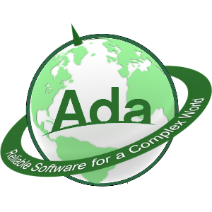
May I ask what firm designed the logo? I’m asking as one with professional training in graphic design and illustration. I also hold a Master’s in Medical Illustration. ![]()

Are you asking about the Ada-Globe ? Or your ‘N’ with stars and comets ?
The question is in reference to the Ada-Globe logo. I added the 'N" which is the Netscape Browser GIF (circa 1994) for fun since the Ada-Globe logo reminds me(somewhat) of the old Netscape ‘logo’ from ~30 years ago. A bit of fun nostalgia for those that are old enough to remember. Sorry for any confusion that may have caused. ![]()
Yesss your N remind me the first Netscape logos ![]()
I personally made the logo from a scratch 3D Sphere (in fact 2) and NASA earth mapping. All is done in Rhino3D with rendering engine.
Have a look to other renderings on the Goodies-3D Promo page on AdaForge.org
PS: I was wandering to build a 3D rotating earth with Ada code in the (universe) background ![]()
I like to see a upper case A coming out of the horizon upside down with planet earth spinning in the upper left while with stars in background and sun appearing behind the A as it adjust course… anyone…
Nice to see a better logo ![]()
But what’s going to be its official color? Black? Or some nice green?
The color of choice would of course be 16#ADA# aka engineering green ![]()